Painting with Wilson Bickford
Wilson Bickford “Remember When” Part 2
Season 6 Episode 3 | 26m 26sVideo has Closed Captions
Wilson adds the details and finishing touches to this summer scene.
In days gone by, folks would have to venture out to the old well-pump to fetch a pail of water. Today’s generation has probably never experienced that chore, but many of us ‘older folk’ have. Do you Remember When? In part 2, Wilson adds the details and finishing touches to this summer scene.
Problems with Closed Captions? Closed Captioning Feedback
Problems with Closed Captions? Closed Captioning Feedback
Painting with Wilson Bickford is a local public television program presented by WPBS
Sponsored by: St. Lawrence County &nbps; &nbps; The Daylight Company &nbps; &nbps; J.M. McDonald Foundation
Painting with Wilson Bickford
Wilson Bickford “Remember When” Part 2
Season 6 Episode 3 | 26m 26sVideo has Closed Captions
In days gone by, folks would have to venture out to the old well-pump to fetch a pail of water. Today’s generation has probably never experienced that chore, but many of us ‘older folk’ have. Do you Remember When? In part 2, Wilson adds the details and finishing touches to this summer scene.
Problems with Closed Captions? Closed Captioning Feedback
How to Watch Painting with Wilson Bickford
Painting with Wilson Bickford is available to stream on pbs.org and the free PBS App, available on iPhone, Apple TV, Android TV, Android smartphones, Amazon Fire TV, Amazon Fire Tablet, Roku, Samsung Smart TV, and Vizio.
- In part one, we worked on the background of this scene.
Now we'll move ahead and put the details on the pump and see if we can get any water out of it.
Join me next on "Painting with Wilson Bickford."
Is anybody thirsty?
(gentle music) Hi, thanks for joining me for part two of "Remember When."
As you recall, in last week's episode in part one, we had started this painting with the old well pump.
We established the background with the clouds and the trees.
We pretty much finished up the house.
Now we're gonna start moving into the middle ground here with the meadow, come forward to the old pail into the pump itself.
So I'm gonna start with my number three fan brush.
Now, this section of the canvas is dry.
As you recall, we had that taped off so I didn't get any paint on here, it's dry.
I didn't see any sense in putting white base coat down there.
It would only lighten my color, and I wanna keep it dark down here in the meadow.
So this area of the canvas is dry.
I'm gonna start with my number three fan brush.
And notice there's a nice light yellowy glow around the house.
So I can build off some of these colors that I had previously with the trees, if I take some of that light yellowy green that I used for the leaves way back when.
I'm gonna take something a little more white and yellow and I want a nice bright glow right around this house.
So I'm gonna tap like this.
Notice how that glow tends to invite the viewer into your painting.
It's the whole point.
You want the viewer to kinda take a look around.
So I'm gonna leave this a little bit lighter right around the house, and I'll get darker as I come away from that point.
You see for the grass texture, all I'm doing literally is just holding the brush horizontally and I'm tapping.
That gives you a nice rough look that's very suggestive of grass.
I'm gonna bring it down certain ways because I want to build on to that with a darker color and I will lose some of this lighter color as I mingle them together, so bring it down farther than you think you're gonna want, then you have some room to work with to encroach the other color into it.
I wanna get a little darker over here.
I want it lightest in here, so I'm gonna go a little darker over there.
Again, I'm using some of the garbage and the trash in my palette that I had from before.
So there are some of the greens that I had previously, but they're gonna work just fine for what I want.
Eventually, as I come way down into here, I'm probably gonna wanna go darker yet, but for right now, I can just use some of these colors.
All right.
I wanna get darker.
So again, I'm gonna take some of this color that I had previously.
It was just some of my highlight color off these trees.
You'll see it's a little bit darker than what I'm using now.
Just blend everything together.
I'm blending by tapping.
I wanna maintain that, you wouldn't wanna do this and start smoothing it this way.
You're gonna lose all that roughness that suggests grass.
And as I come lower, I wanna go darker, and I actually wanna use a little more texture.
So I'm gonna switch back to this brush.
This was the brush that I had that I used for the leaves on the trees way back when.
When I left off with that brush, I had used a lighter yellow green for the highlights.
So I'm just gonna wipe this brush off.
I'm gonna come back with something darker.
I'm only using this brush because it's bigger.
It holds more paint and I've got still fair amount of space to cover here, so I wanna just take that in a little faster.
I'm gonna mix more blue and yellow together here, little bit of black this time.
I wanna go quite darkish.
The ish is the important part, darkish.
Don't go black.
We want a really dark, dark rich green kinda like that.
You know that song.
♪ Hello darkness my old friend ♪ Well, this right here is your friend.
This dark, you want this dark down here.
As I go upward, I want to weave that into the previous color.
So once I get all of that white in the canvas filled in, I make sure all that texture is gone.
I don't want any just bare canvas showing through.
Once I get all that pretty much filled in, I'm just gonna keep encroaching upward.
And I use a lighter touch.
I'm kinda going between the light green and the dark green just by tapping like this.
And eventually, that will slowly just fade off and I can mingle those two areas right together so it's a gradual transition.
That sounds like a lounge band out of the '70s, doesn't it?
Music by Gradual Transitions.
Hmm, food for thought.
Maybe my next group.
Okay.
Down here, I'm just gonna fill this in right down to the border.
And again, it's all just by tapping.
I'm running out of paint, so I'm just gonna take some of this garbage off my palette.
I'll add a little bit of black just to make sure it stays as dark.
Really from here on, all I need is coverage just down to this border.
You know what Michelangelo said to the ceiling of the Sistine Chapel?
"Don't worry, I got you covered."
Oh, yeah, he did, that's what he said.
Okay, that's looking pretty good.
I want just a nice, smooth transition down through there.
There are going to be cast shadows from the pail and the pump itself.
We can tell by the way the house was lit this way.
It's kinda over the knoll, so we didn't really need a shadow for the house.
We can tell which way the light's coming from.
If I go back into this color with my fan brush, now this is the color I just left off with.
This needs to be just a little bit darker.
So I'm going to use ultramarine blue, yellow, a little bit of black.
It's a cast shadow, so it needs to be a little darker than anything we've got up here in the grass so far.
Cast shadows are where the light is literally blocked out.
They're always darker.
So I'm just gonna tap some of this on my fan brush and to the left of the bucket and the left of the pump.
It doesn't take much.
We don't have to draw a pump shape or anything like that.
We're just gonna have a little bit of a sense of a shadow.
It doesn't make much sense there right now, but it will once we remove the tape and develop the pump and the pail.
All right.
I'm gonna swish this brush out and we're gonna spatter in a little bit of texture in that meadow.
On this painting, I pretty much used white, but you could use anything.
I don't have red or orange or purple or anything on my palette today, but if you've got those colors laying around and you wanted to use a different color, by all means, do.
Purple would look like maybe clover or forget-me-nots or violets.
You could use pink.
I'm gonna use white here.
The white spatters look like maybe little white daisies or Queen Anne's lace, something like that.
It's all good, it's just a matter of personal preference.
I am gonna thin this down a little bit.
The idea is to let the brush bristles snap forward and spray a little bit of a dotted effect.
If you look right here on my palette, I'm gonna demonstrate.
This is the white base coat and I've added a couple drops of paint thinner to it.
And if I pull the bristles back and let them snap like this, you get that spray of dots, which looks like little wildflowers.
I use the same technique for stars in the sky.
If you catch the Monument Valley Moonlight project in this series, I've got a nighttime scene in the desert and we got stars in the sky and achieved it the same way.
It's good for stars in the sky.
It's good for flowers in a meadow like this.
You can use it for falling snowflakes or gravel on a road.
Spatter is a very, very, very useful technique to know about.
I've just put a little more thinner, which'll make my dots a little bit bigger.
I want them a little larger as they're getting closer to us in the foreground.
And you can go crazy with this, but try not to.
Don't overdo it, just enough to tell the story.
Gives your meadow a little bit of interest and some texture.
Okay, we're gonna move on to that pail.
I need to remove the tape.
And as before, I mentioned that you could use your little sharp knife to dig under that and take it off.
If you happen to have a painting knife laying around, that one's probably safer, easier.
So having said that, maybe I will do that and use the painting knife.
You can dig under it with the sharp knife, too.
It's just as easy.
Just be careful.
I'm gonna dig under that tape, and there's my pail right where I left it.
Now we're gonna add light and shadow on this pail.
Because the light's coming from this way, notice that it's light on the inside of the left edge.
It's light on the outside of the right edge, so they're kind of opposite each other, same as the shadow.
The shadows are opposite this way.
The highlights are opposite this way.
I'm gonna use the detailed script liner with some of the white base coat, a little bit of the ultramarine blue, a speck of the burnt sienna.
We'll gray that down.
The blue and sienna are complementary to this other.
This burnt sienna's considered to be a dark orange.
Blue and orange are complementary to each other on a color wheel, which just means they're directly opposite each other on the wheel, but they gray each other.
That's the idea of complementary colors.
So say I'm going to go lighter on this inside edge right here over about halfway or so, give or take.
Be careful, stay in your lines.
I'm gonna put that same color here on the outside edge over here.
When I highlight, or I should say, when I put the shadows on I will do just the opposite.
They'll go on the opposite edges.
That looks kinda funny.
You'd think that everything's the same, it's not.
It's because it's round.
It's got a different surface on the inside.
It's hollow, which is common sense basically when you look at it.
It makes sense.
Okay, I'm gonna put that on like that.
I need a darker shadow tone for the other side so I can build off the same color just by using a little more ultramarine blue, a speck more of the sienna.
If it gets too brownish, too gray, put a little more blue back with it.
It's easy to go too far with it, so just realize it's an easy adjustment to swing it back the direction that you want.
I'm gonna try this and see if it's gonna be dark enough for what I want.
Yeah, I think that's gonna work.
So I'm going to paint this side of the pail on the inside.
Notice I've got one hand braced on another.
This is touchy stuff, takes somewhat of a steady hand.
Now it's gonna look pretty bad here for a moment.
I'm gonna let that sit.
I need to come back and blend those two together.
I need to wipe the brush off to do it, so there's no sense wiping the brush off just to put more paint on it again later.
I wanna do both of these areas while I've got it going.
My paint feels a little dry.
I'm gonna put just a drop of thinner with it.
See, that pail is dry canvas where I had that taped out, so that dry canvas really draws the moisture out of your brush, tends to dry things out moreso.
So sometimes you have to thin it down.
All right.
All we need to do is bring those two together.
So I'm gonna wipe this brush off.
I like to fuzz it out like this manually with my fingers, spread it out like a little rake.
It widens it out, gives me more surface area, and then I'm just gonna pull down, but I'm gonna go to the left and right over that line in the middle.
So I'm going over into the dark and going over into the light, back and forth this way as I'm pulling downward strokes.
You'll see it just gradually melts that line away, so it's a gradual transition from light to dark.
It makes it look round on the inside.
It's very easy.
I'm gonna wipe that off and I'm gonna do the same thing on the outside of the pail.
I'm being very careful I don't get down into that green and drag green up into my pail.
If I do, I would just simply wipe it off, wipe that bad spot out with a towel and put more of my pail color over it.
It's no big deal, easily fixable.
See that's starting to look pretty round there now, isn't it?
All right.
That's exactly what we want.
I've got a little bit of a shadow underneath the lip.
I just need something darkish.
Here we go with the ish again.
I'm just gonna take, oh, some ultramarine blue, speck of black.
I'm definitely gonna have to thin this down.
I'm gonna roll that brush to a point.
I'm just gonna put a little thin line right underneath that edge so it kind of suggests a lip.
I'll soften that a little bit.
I'll save some of that same color for the handle on the pail.
I'm gonna wipe the brush off and just kinda blend that bottom edge away a little bit, soften it in so it looks more like a shadow and not so much an outline.
You can leave a hard line on the top of it, but kinda soften the bottom edge away against the rest of the pail.
Okay, now notice this one's got some character and it tells a story.
I've got some rust on there.
I'm gonna take this same brush with some burnt sienna.
Notice I'm gonna flatten it out on two sides.
I'm not thinning this paint down at all.
The paint is quite thick.
That's what I want.
It's gonna be more of a dry brush technique if you're familiar with that.
And I'm gonna just tap it on the back side of the brush like this.
If I come up and just lightly kinda drag and graze.
Don't just polka dot it and put dots on.
I'm kinda rubbing it.
On the weave of the canvas, you'll see it picks up the bumps and the texture, what's called the tooth of the canvas.
It picks up the tooth and kinda gives you that broken, rough, corroded look.
I'm also gonna take some more of that color and just a speck of black and a speck of the ultramarine blue, do the same thing, just something to darken it and dull it a little bit.
I want a little bit darker accent.
You'll notice, I've got some lighter rust in there and then some darker spots.
Even though it's just rust, rust isn't all the same.
You've got some brighter orangy rust sometimes and you got darker, duller rust.
Just a few little touches of that here and there is all it takes to give it a little bit of character.
Put as much or as little as what makes you feel good.
Eventually, I'm gonna have to bury that into this grass as the pump.
When I get to the pump, too, we'll put some grass up around the bottom.
I'll do those both at the same time.
There's no sense getting in a rush doing it right now.
I'm gonna use some of that darker color that I had for the shadow on the lip.
And I'll thin that down again just a tad with my mineral spirits here.
I'm gonna put a little round collar.
I don't know what you'd call it.
The little thing where the handle hooks into.
There's a little bump there where the handle attaches.
I'm gonna bring this around like this around the other side, something about like that.
There's our pail.
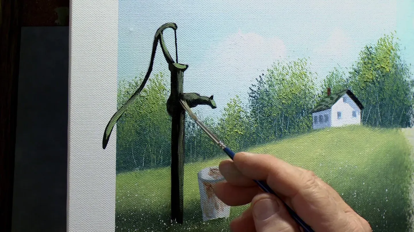
Okay, I'm going to take the tape off the pump.
I left a little tab there to be able to grab that.
You may or may not have a little bit of bleed underneath.
Now, see, I've got some on mine a little bit, which is normal.
That's okay.
Sometimes I do, sometimes I don't.
Kinda depends on your brand of tape and how old the tape is, how much you burnish it down, how aggressive you get with your brush when you're putting the background in.
See, I got a little bit of bleed underneath on the edges of that.
There we go.
That spelt was giving me a hard time.
Now, I'm gonna have this underneath here as well.
So while I'm at it, I'm going to do the pump handle that's sticking out of the border.
But what I need to do is come back and clean that edge up.
I'm gonna use my detail script liner, and I'm gonna thin down a little bit of black and I'm gonna touch up all my edges and just apply a very, very thin coat of that thin black over the whole pump.
I'll be right back.
(gentle music) In lieu of the metal pail, if you'd rather have a wooden bucket, like an old type of a barrel style, you can put your shape on, underpaint it with a good dark tone.
This is ivory black with a little bit of burnt sienna, but you'd wanna underpaint it dark first.
Now, I'm not gonna do the whole pail here, whole bucket, just give you the idea.
But you'd underpaint that, swish your brush out.
Use a lighter value of possibly some white with burnt sienna and a speck of black, something lighter.
And if you come in over the top, put the slats on.
Leave a little sliver of the dark in between the slats.
It'll look like a wooden bucket rather than a metal pail.
Just a different way to do it.
Give it a try.
Okay, I removed the tape from the pump and I've taken a thin black and I've just kinda touched up the edges just to get nice tight edges on it again.
Don't paint the whole pump just for the sake of it.
If you do, you just wanna put it on really, really super thin 'cause you don't wanna muddy down your highlights too much.
I'm gonna use a green pump again like I did for there, and I'll take some of this white base coat on my detail script liner with yellow and a little bit of cerulean blue.
The cerulean blue with the yellow really gives me a nice bright green that I like.
Something like this.
See, I'm gonna flatten the brush out on two sides like this.
And I have to steady my hand here, so I'll try to keep my shoulder out of the way.
We've got the light coming from the right hand side, so I'm going to kinda favor those sides.
Just think of where it's gonna hit if the light's coming in from the upper right.
It's gonna hit on the top sides of most of these angles.
You can refer to the finished one there.
There'll be a photo of that on the PBS website as well, a finished picture that you can print off as a reference.
See, it doesn't take much to start bringing this around.
Now, see, I'm gonna put a little bit on this handle.
And see, by bringing that forward, it just really gives you a nice three-dimensional feel, which is pretty cool.
I'm gonna wipe the brush off and fuzz it out like I did before, widen it out like a little rake.
And the lines in between where the green and the black meet on these round angles, you wanna soften those so there's no hard edge there.
Everything will look square if you leave it that way.
So you wanna kinda soften everything.
So everything, all around angles like this pipe sticking out of the ground and this nozzle here and the spout.
Everything looks nice and round.
If you wanna add a little more snap, don't be afraid to re-highlight.
I'm gonna take a little more white and yellow into that color.
Give it a little extra pizzazz.
Oh yeah, look at that, like that.
Life is too short for dull colors.
Use some bright ones once in awhile.
That's the reason I paint is color.
I love color.
See, if I do that, if I go back and do it, I've gotta kinda soft my edges again if they've become harsh and a couple of them have.
So I just wipe the brush off, same as before.
It's just a series of adjustments.
You're just checking contrast and one dark value against a light value.
That's all painting is.
All right, that's looking pretty good.
I've gotta bury both of these into the grass, so I've got my fan brush here.
I've still got this brush that was dirty, which would probably work.
I'll show you.
Just take it as is, and just be careful.
It's a bigger brush.
If this one scares you to get into that small spot, use your fan brush.
Doesn't matter how we do it as long as we do it.
Just want a softer edge on the bottom of the pail and the pump so they look like they're nestled down into the grass a little bit.
I'll put just a couple little specks of white there 'cause I kinda obliterated my flowers.
The spatter flowers are in there.
All right, that's looking pretty good.
I think I've got just a moment here.
I'm gonna take some black, maybe a little bit of burnt sienna in it, and maybe right up here on this part of the spout, I'm gonna place a bird perched right there.
He's sat on the backside, so I don't have to show his tail or anything.
We can just have his body and his head.
He's sitting up there minding his own business.
Just something you can add for extra interest.
Take your time with it.
Maybe I'll put him on this side and I'll bring his tail over in front.
Then he looks like he's sitting on this side of it.
And I can tweak that and touch him up later just to refine him a little bit.
This is a painting that I do in some of my classes, so a variation on a theme.
Just a closer view of the pump without the house and all the hoopla of the background.
Nice red cardinal perched on it, snow on it.
People love this when it's a great winter theme, great for classes.
Give this one a shot, too.
Notice I got some icicles coming off the spout.
So give it a try.
I hope you enjoyed this lesson, and I had fun bringing it to you.
Until next time, stay creative and keep painting.
- [Narrator] All 13 episodes of "Painting with Wilson Bickford," series six, are now available on DVD or Blu-ray in one box set for $35 plus 4.95 shipping and handling.
Or learn the techniques used to paint "Stand of Birches" with the in-depth "Paint Smart, Not Hard" series of Wilson Bickford instructional DVDs.
Additional titles available.
Order online or watch or download directly to your computer or mobile device.
More information at wpbstv.org/painting.
(gentle music) (upbeat music)


Support for PBS provided by:
Painting with Wilson Bickford is a local public television program presented by WPBS
Sponsored by: St. Lawrence County &nbps; &nbps; The Daylight Company &nbps; &nbps; J.M. McDonald Foundation